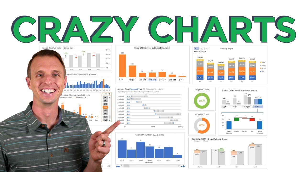
 In this video, I share 10 different advanced Excel charts. I explain what type of data to use with, when to use them, and the advantages they provide over traditional charts.
 The following link is to the accompanying blog post that contains links to all of the posts & videos for each chart.
0:00 Intro
0:58 1. Column Chart with Percentage Change
1:49 2. Conditional Donut Progress Chart
2:22 3. Interactive Histogram with Details
3:14 4. Dynamic Histogram or Frequency Distribution Chart
4:28 5. Annual Trend with Monthly Details
5:39 6. Interactive Waterfall Chart
6:43 7. Variance on Clustered Charts
7:26 8. Actual vs. Multiple Targets Chart
8:05 9. Stacked Bar with Dynamic Data Labels
9:24 10. Comparative Distribution Chart
10:13 11. Bonus: Zoom on Charts Macro
Related Videos:
Progress Circle Chart in Excel:
Column Chart That Displays Percentage Change in Excel:
Actual vs Targets Chart in Excel:
How to Create an Interactive Histogram Chart that Displays the Group Details:
What type of chart do you want to see created?
Please leave a comment below with info on what type of chart you'd like to see a tutorial on, or explain what type of data you have. Thanks! 🙂
#MsExcel #ExcelCampus

0 Comments